The availability of big data generated by multi-model simulations provides opportunities for extracting information and knowledge from it. To create a solid base for the future successful realization of task 5, it was necessary, in the previous period, to develop software that provides the intuitive representation of big data. An existing large data set was used for this purpose. The data set (Figure 1) contains 552,959 records, where each record contains data related to a Monte Carlo scenario simulation. The data were grouped into 17 columns, so that the first 16 columns contain an appropriate risk measure of a scenario, such as the conditional failure frequency, the frequency of exceeding certain elevation in different parts of the system, minimum and maximum reservoir levels, etc. The seventeenth column contains a description of the simulated scenario: operating states of the system’s components (‘Gate fails in place’, ‘Sensor Error’, etc.) and causal factors (‘Earthquake’, ‘Debris/Ice’, etc.).
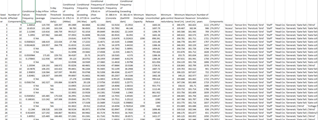
Figure 1. A tiny part of the existing large data set
Determining the number of different operating states of system components and the number of different causal factors from the data was automated through a Python script, that can be applied to any large data set that contains the abovementioned columns.
To obtain an assessment of the potential impact of combinations of events in the dam system on the ability to safely manage water flow in dams, data grouping was performed. The records of scenarios containing the same external causal factors were grouped. For each group, statistics were calculated in terms of minimum, maximum, average, and median values, standard deviation, and variance for all risk measures.
The data grouping was first implemented as a script using the NumPy and Pandas libraries of the Python programming language. To avoid working with strings, the string descriptions of the simulated scenarios were coded using the one-hot method. The column containing the string description of the operating states of system components and causal factors was replaced with 22 new columns, which is the total of the possible operating states and possible causal factors. The new columns are filled with ones and zeros depending on whether there was a corresponding component’s state or external causal factor in the string description of the scenario or not.
Further, the computational server hardware and software installation was completed, providing the recourses for parallelization of the data grouping process. The script for grouping the data was written Using the PySpark interface for Apache Spark in Python to achieve the optimal speed of the grouping process over dedicated hardware. The speed-up is achieved by parallelizing the process on all processor cores using Apache spark, which automatically performs the parallelization.
On top of all, the web-based application was developed using the Flask library of the Python programming language. The application enables the user to do the following:
- Selecting the .csv format file that contains the big data to be uploaded to the server (Figure 2).
- Starting preprocessing of the data (Figure 2) – invoking the above-mentioned one-hot encoding of the data.
- Choosing the first level of grouping (Figure 2). If the Causal factors are chosen, the data will be grouped such that the rows with the same external causal factors will be in the same group. If the Component operating state is chosen, the rows which contain the same combination of the system’s components operating states will be in the same group. If None is chosen the data grouping will not be performed.
- If the user selects one of the first two options for the first level grouping, the Hierarchical grouping can also be selected. Then at the first level, scenarios with the same external causal factors are grouped, and at the next level, grouping is performed according to the operating states of the system components. Or, at the first level, scenarios with the same operating states of the system components are grouped, and then at the next level, grouping is performed according to the external causal factors.
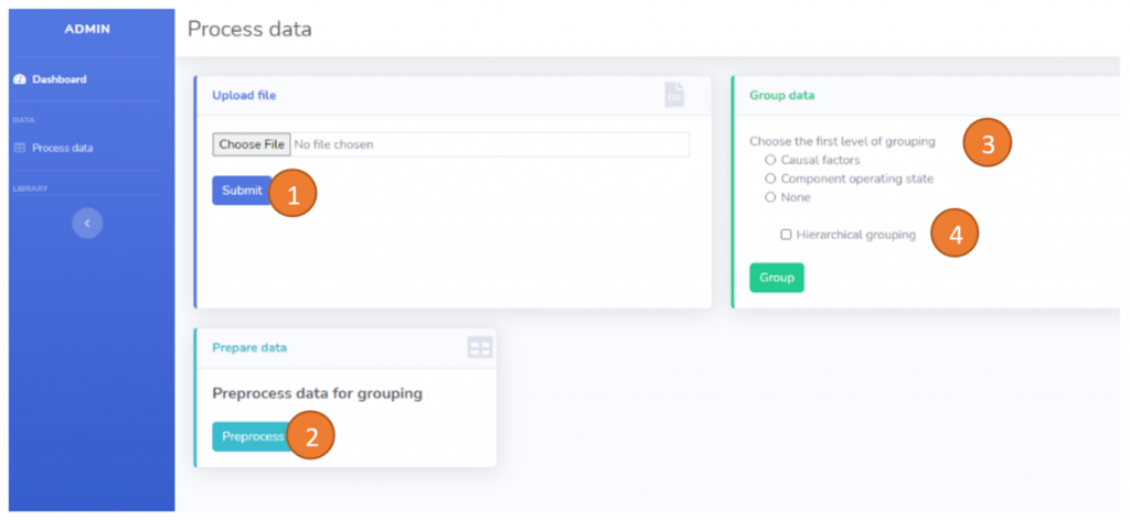
Figure 2. The web-based application – Screen 1
- When the selected type of data grouping has been performed, the user can access the Reporting dashboard (Figure 3). On the left-hand side of the dashboard, the user can choose the criticality parameter for which the group statistics will be shown in the table on the right. The table consists of eight columns: groupID, minimum, maximum, average, and median values, standard deviation, and variance for all risk measures. The last column contains two action buttons. The blue action button opens the visual report for the selected group (which is explained in more detail in item 7). The green action button shows the details of the selected group: a combination of the causal factors, or a combination of the operating states, depending on the type of grouping that was selected for the first level.
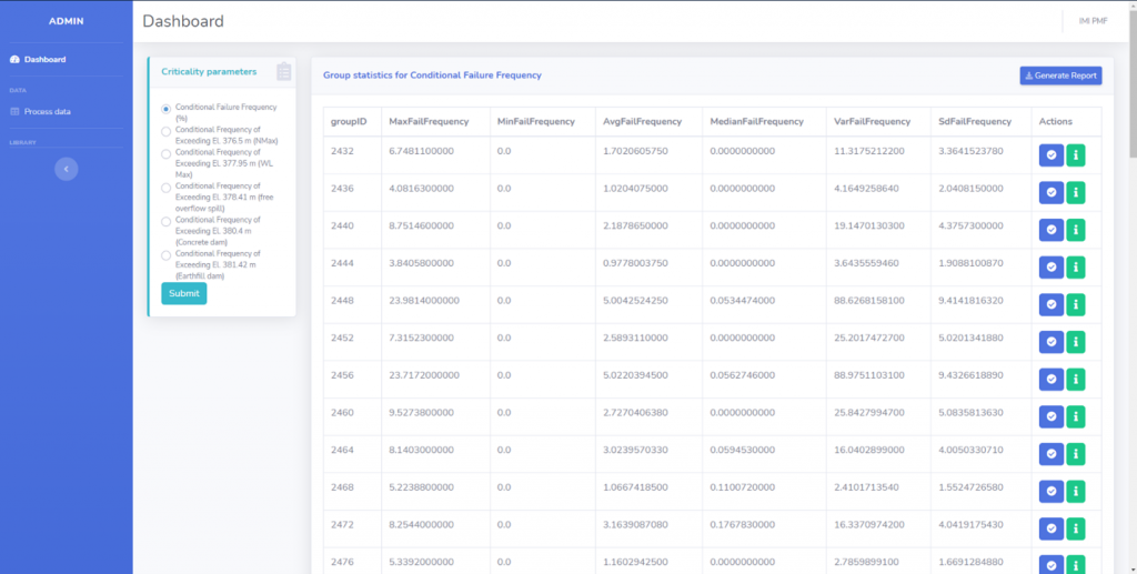
Figure 3. The web-based application – Screen 2
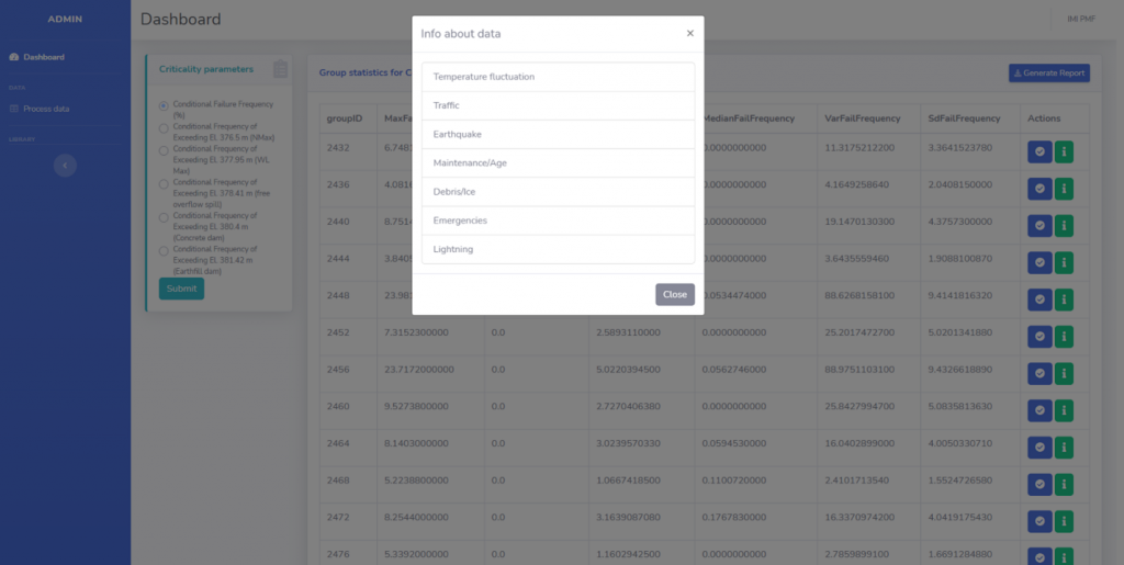
Figure 4. The web-based application – Selected group details
- Clicking the green action button opens the window that shows the details for the selected group (Figure 4). In the example in Figure 4, the selected group includes all the simulation scenarios with the following causal factors: Temperature fluctuation, Traffic, Earthquake, Maintenance, Debris/Ice, Emergencies, and Lightning.
- Clicking the blue action button opens the visual report for the selected group (Figure 5). On the right-hand side, the box plot for the selected risk measure is shown. In the example in Figure 5, the box plot depicts the spread of the conditional failure frequency (CFF) (in percent). The box marks the 25th and 75th percentiles, called the lower (Q1) and upper (Q3) quartiles, respectively. The red line marks the median. The distance between the lower and upper quartiles in the boxplot is called interquartile distance (IQR), that is IQR = Q3 − Q1. The whiskers extend from the box to show the range between below Q1 and above Q3. The values shown as dots above the upper whisker (or below the lower whisker) are outliers.
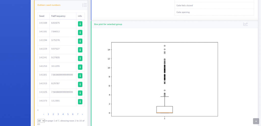
Figure 5. The web-based application – Screen 3
For this kind of problem – spotting the scenarios that can lead to the failure of the system, outliers are of great importance. They are pointing at those specific combinations of events that can lead to a system breakdown. It can be noticed that for the majority of combinations of operating states, CFF is very low, or zero. Those combinations that have higher CFF values are shown in the list on the left-hand side, in terms of the seed number of the simulation that produced them and the corresponding value of the risk measure. Seed numbers can be clarified by clicking the info action button, which results in the screen shown in Figure 6.
- For the selected group, the following can be shown: (1) subgroup(s) that produce the minimal value of the selected risk measure; (2) subgroup(s) that produce the maximal value of the selected risk measure; (3) subgroup(s) that produce a value of the risk measure that is less than an arbitrary value; (4) subgroup(s) that produce a value of the risk measure that is greater than an arbitrary value. In the example in Figure 7a and Figure 7b, for the selected group of causal factors, one can select to be shown a certain combination of operating states that produce minimal/maximal or the risk measure value that is under/above an arbitrary value.
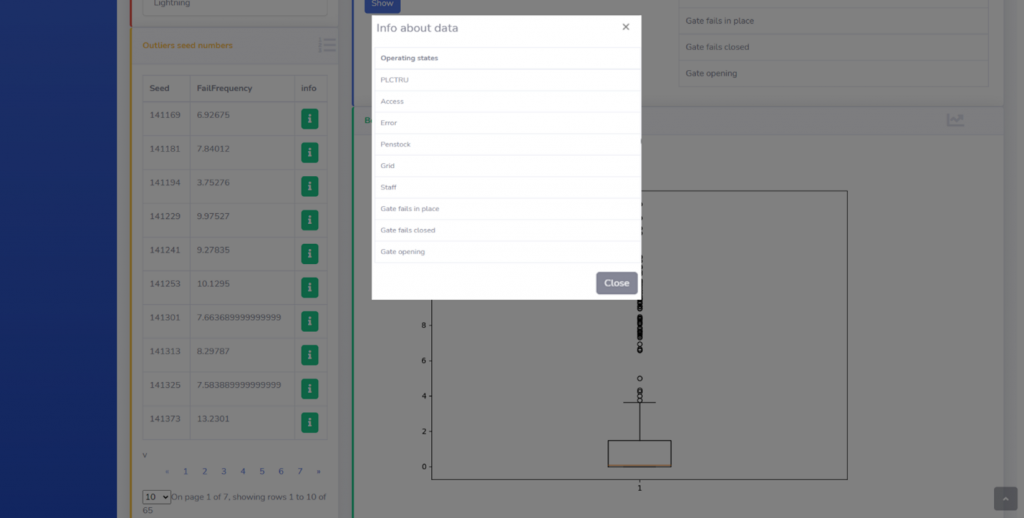
Figure 6. The web-based application – Selected subgroup details

а) Selection of the risk measure characteristics that are produced by scenarios containing a certain combination of operating states

б) Combination of operating states that produces maximal CFF for the selected group
Figure 7. The web-based application – Screen 4